The Samsung Galaxy S III Preview
by Brian Klug on May 3, 2012 9:12 PM ESTIt's been a long day in London, and hot off the heels of our Galaxy S III performance preview is some discussion about the hardware itself. For any successful OEM, following up on a successful product with another equally successful product is a challenge. It sounds obvious when you write it, but if you look back at almost any other very popular smartphone, you'll see a similar trend. People love watching something become the obvious flagship, then rumor and speculate on what the successor will bring, and hopefully when the curtain goes up the expectations are met. It's no small surprise then that there are some obvious parallels between reactions to the iPhone 4S announcement and today's Samsung Galaxy S III announcement, but after spending all the time available with a demo unit, I've come away decently impressed with what Samsung has crafted.
| Physical Comparison | ||||
| Apple iPhone 4S | Samsung Galaxy S 2 | Samsung Galaxy S 3 | HTC One X (AT&T) | |
| Height | 115.2 mm (4.5") | 125.3 mm (4.93") | 136.6 mm (5.38") | 134.8 mm (5.31") |
| Width | 58.6 mm (2.31") | 66.1 mm (2.60") | 70.6 mm (2.78") | 69.9 mm (2.75") |
| Depth | 9.3 mm ( 0.37") | 8.49 mm (0.33") | 8.6 mm (0.34") | 8.9 mm (0.35") |
| Weight | 140 g (4.9 oz) | 115 g (4.06 oz) | 133 g (4.7 oz) | 129 g (4.6 oz) |
| CPU | Apple A5 @ ~800MHz Dual Core Cortex A9 | 1.2 GHz Exynos 4210 Dual Core Cortex A9 | Exynos 4 Quad (4412) Quad Core Cortex A9 / Dual Core Qualcomm Snapdragon MSM8960 | 1.5 GHz Dual Core Qualcomm Snapdragon MSM8960 |
| GPU | PowerVR SGX 543MP2 | ARM Mali-400 | ARM Mali400MP4 / Adreno 225 | Adreno 225 |
| RAM | 512MB LPDDR2-800 | 1 GB LPDDR2 | 1 GB LPDDR2 | 1 GB LPDDR2 |
| NAND | 16GB, 32GB or 64GB integrated | 16 GB NAND with up to 32 GB microSD | 16/32/64 GB NAND with up to 32 GB microSD | 16 GB NAND |
| Camera | 8 MP with LED Flash, Front Facing Camera | 8 MP AF/LED flash, 2 MP front facing | 8 MP with AF/LED Flash, 1.9 MP front facing | 8 MP with AF/LED Flash, 1.3 MP front facing |
| Screen | 3.5" 640 x 960 LED backlit LCD | 4.27" 800 x 480 SAMOLED+ | 4.8" 1280x720 SAMOLED HD | 4.7" 1280 x 720 LCD-TFT |
| Battery | Internal 5.3 Whr | Removable 6.11 Whr | Removable 7.77 Whr |
Internal 6.66 Whr |
Hardware & Design
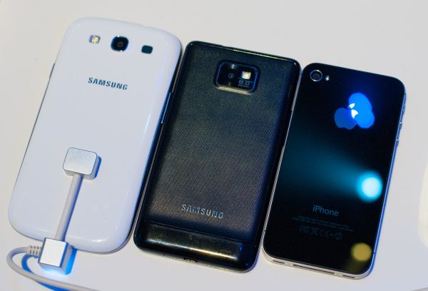
Samsung says that the SGS3's design derives its inspiration from nature - at one point the phone's shape was compared to that of a water droplet, and at another to the 'curves found in nature.' To be totally honest, I think it's fairly easy to see that SGS3 draws strongly on the design language from the APQ8060 based SGS2s, those with LTE and DC-HSPA+. If you squint at the phone's basic outline, you can see that design language, and for that reason it seems as though nobody should be surprised that SGS3 looks this way. Design follows a clear evolution, and the n-1 from SGS3 in this case are the latest SGS2s. Probably the biggest SGS3 related rumor was the expectation of a ceramic unibody construction.
Instead, the device is the slick plastic that harkens back to the SGS1, and comes in a dark blue color in addition to white. Why that was done is a bit of a puzzle to me, since SGS2's textured back felt like the right way to do things if they needed to be made of that material. Quite honestly, this is my only major disappointment with SGS3, and clearly HTC has won the industrial design category this time around with both the One X and One S. It's hard to get a good subjective grasp on how something is going to feel based on even an hour or two playing with a demo unit and attached security tether, but I think more of the SGS3's exterior after that time than I did seeing it on screen.
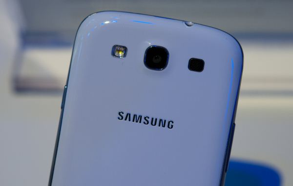
The entire back cover also peels off (there's a thumb slot up at the very top) and ostensibly there's a removable battery and microSD card slot under there. I didn't get a chance to check with the demo unit, however. The backside is either entirely white for the white model, or a faux metal-texture plastic on the dark blue version. Samsung put the speakerphone up at the top adjacent to the camera
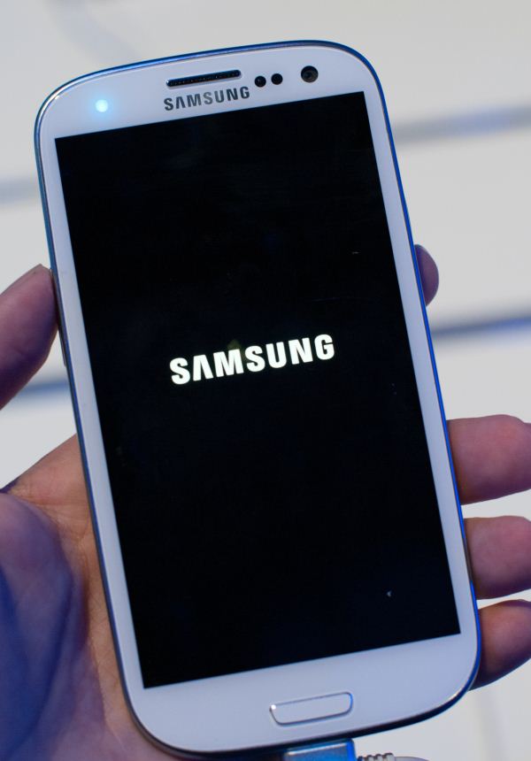
Up top is a gigantic three color (RGB) notification LED which is honestly probably the best I've seen in a device to date. When it's off, the LED is entirely hidden (Galaxy Nexus style), and when it's on, it's nice and diffuse. Right of that are the usual ambient light sensor, proximity sensor, and the new 1.9 MP front facing sensor. At the bottom is the same button arrangement as the SGS2 - menu, home, and back. The menu and back buttons likewise disappear until they're illuminated on use. The home button has been made slightly recessed and even more rectangular; this took a while to get used to. Button placement otherwise remains typical Samsung, with power/lock on the right, volume on the left.
The Display & Software
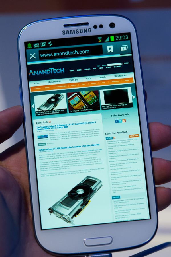
The display is 4.8" SAMOLED HD, no plus, which means a PenTile RGBG subpixel array is present. This is no surprise considering the amount of engineering effort Samsung has put into the very similar Galaxy Nexus display. One thing I will say is that I didn't notice any of the mura or luminance inconsistency that so afflict the Galaxy Nexus' panel. It's a subtle point that does make a difference considering how many people noted and objected to it. Even at this size, the angular subtense of one subpixel is still pretty close to that of the Galaxy Nexus (0.454 arcminutes for Galaxy Nexus versus 0.468 arcminutes for SGS3). If you believe in Nouvoyance's ability to emulate one logical pixel with either an RG or BG unit, putting two of them together still gets you a logical pixel under one arcminute (corrected human visual acuity). The quick and dirty of it is that subpixels are difficult (but not impossible) to discern. Take the Galaxy Nexus, subtract the luminance grain, make it a bit bigger, and you have the SGS3 panel.
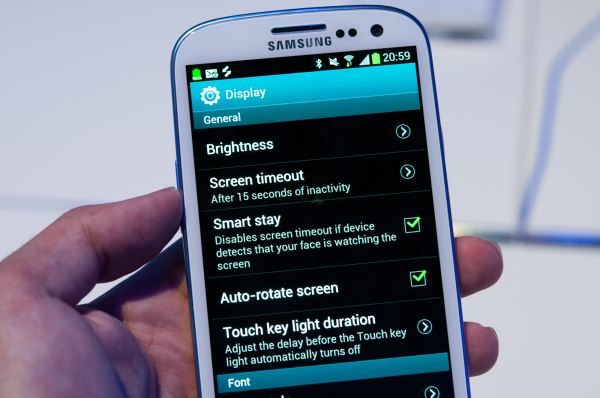
One of SGS3's highlighted features is "Smart Stay," which basically will keep the display on past the defined timeout period if it detects a face with eyes open in front of the device. The idea is to stop those times when the device goes into standby while you're still reading or holding it.
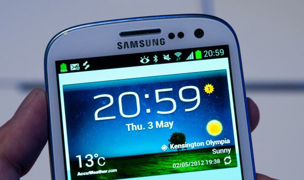
When it's active, you get an eyeball logo in the task bar as shown above. Almost every new ISP these days has facial recognition blocks built in, and I can't imagine the CV for watching to see whether both eyes are open or closed is that hard, so this probably won't eat up too much power.
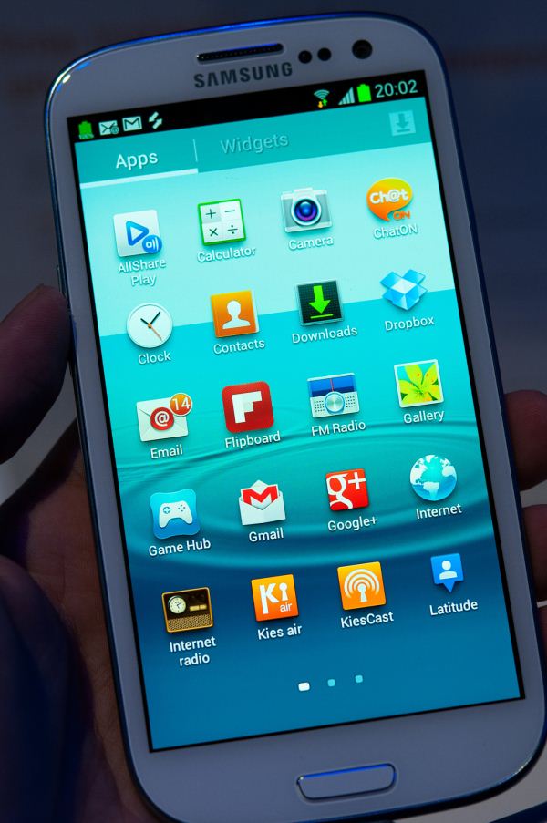
I guess that brings me to the Software (Android 4.0.4) and TouchWiz on SGS3. If the TouchWiz on the SGS2 ICS ROM was a 10/10, and stock ICS is a 0/10, the level of TouchWiz intrusiveness on the SGS3 is about a 6/10. It's there, but it feels less intrusive and the OS as a whole is more ICS-ey. The launcher is basically the stock one, though the homescreens, widgets, and notification shade are definitively TouchWiz. Samsung has also ported some other changes from the Galaxy Note over - specifically screenshots, which are accomplished by sliding the side of your hand over the entire display. Browser, dialer, and camera are all Samsung-styled. One positive thing (which it blows my mind no other OEM has done) is add the option to display battery percentage alongside the battery indicator in the notification bar.
Camera
The next big part of SGS3 is camera. The device bumps up the front facing camera to 1.9 MP with BSI (previously FSI), and keeps the rear facing camera at 8 MP but includes a new sensor. With Francois' help, I ran voodoo report on the SGS3 and we've obtained a lot of information, including the rear camera CMOS, which is an as of yet unannounced S5C73M3 8 MP BSI sensor. Without getting more information, I can't tell you pixel pitch or optical format, but it's clearly a latest and greatest CMOS that Samsung hasn't even made directly public yet.
I took sample photos and a video on the SGS3 and was able to get them to myself - via EXIF data the system is F/2.6, with a focal length of 3.7mm. Obviously on paper that isn't as fast of an aperture as many others are shipping, and I wager that's why it wasn't highlighted in the presentation. The photos I got off aren't particularly great, however the room was indeed dark and hazy with the smoke machines Samsung had going. Samsung also includes a native HDR mode for SGS3, in addition to enabling 3FPS continuous and instant capture modes, and extremely fast camera launch times.
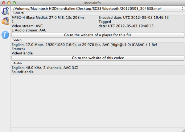
Video is sort of the same story - it's hard to judge quality based on just a short time with a camera in a very dimly lit room with purple overhead lights (yay white balance nightmare) and demo software. That said, the SGS3 is using among the best encode parameters I've seen on a smartphone to date - 17 Mbps H.264 high profile with CABAC.
I've uploaded the video sample file to the AT servers for you to download. Again I'm reserving judgement until we get final software and something of a more realistic environment to shoot video in, but at least Exynos 4 Quad has a beefy encoder.
Performance & Battery Life
We've already gone into great detail about performance of the Galaxy S III, but we can sum up what we know in two charts:
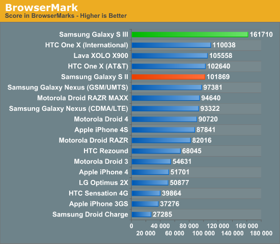
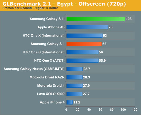
The international Galaxy S III has an incredibly fast GPU (a very high clocked Mali-400/MP4), and a browser that runs javascript extremely quickly. The combination of the two is really what you'd expect to see given how big of a splash the Galaxy S II made upon its arrival.
The performance is really enabled by Samsung's 32nm high-k + metal gate LP process. The move to 32nm allows Samsung to reduce costs (the two extra CPU cores are a minimal impact to die area, the new Exynos 4 Quad should be smaller than its predecessor), while ramping up clock speeds. Samsung went conservative on the CPU clock (1.4GHz for an A9 isn't unheard of already), but appears to have pushed the limits on the GPU clock as we saw as much as a 66% increase in 3D performance. The other major impact of the move to 32nm HK+MG LP is a reduction in leakage current. A major benefit of using a high-k gate dielectric is to significantly decrease leakage current (or significantly increase frequency). In turn, this should have a tangible increase in battery life. Combined with a very large 7.77Wh battery, we should see a good improvement over the Galaxy S II. The display may be a bit of a drain, but I can't see this being anything but better than the Galaxy Nexus in the battery life department. Whether or not it'll be able to tie the One X is another question entirely - and one that we'll wait until we have final hardware to answer.
Final Words
I have to be totally honest - when I saw the SGS3 design for the first time, my initial reactions were somewhat cool. The device's design is an obvious evolution of the Qualcomm-based DC-HSPA+ or LTE SGS2s such as the T-Mobile SGS2, not the radical, over-hyped, under-substantiated (and perhaps unrealistic) unibody ceramic or other magicmaterial that everyone wanted. It's the same effect we saw with the iPhone 4S - rumors build to a fever pitch, everyone keeps adding more things to the wish list, and then reality hits home when the curtain lifts. Everyone wants the impossible, but only years of manufacturing process improvement and scale brings that closer. That said, I think HTC has clearly won the industrial design and in-hand feel category this time around. The obvious comparison point is the HTC One X (Tegra 3). When I compare the two side by side, the differentiation really comes down to display, and camera. The One X LCD is beautiful, and the One X/S camera is a very good performer. Subjective UI snappiness between the two are actually very close even though the SGS3's Exynos 4 Quad clearly holds an advantage over Tegra 3, but it ends up being accessories rather than core which will define the better device.
At the end of my time with the SGS3 my mood has changed considerably for the positive. As we showed in our SGS3 performance preview, the handset is, as Samsung described it, capable of posting "superlative" benchmark numbers with its 1.4 GHz Exynos 4 Quad SoC. It goes without saying that even with TouchWiz running atop Android 4.0.4, the SGS3 is butter smooth, everywhere. In the time that I played with the SGS3, my impressions and attitude toward the device changed significantly, as well. I don't think 4.8" is too big, the same way I didn't think 4.65" on the Galaxy Nexus or 4.7" on the One X was too big, but there's clearly a ceiling for phones right at or around 5". Samsung also delivered on its promise of bringing the device to store shelves (at least for non US shoppers) quickly after launch, for which it deserves kudos. The only lingering question is - what exactly will be in store for the LTE devices headed to the US, and just how far away is that launch? For now though, I come away from the International SGS3 a lot more positive than I did upon initial inspection.








126 Comments
View All Comments
Malih - Thursday, May 3, 2012 - link
I like it, especially the not-gingerbread-y touchwiz, I suppose Samsung decided to give the SGS2 gingerbread look as a selling point to this new phone.I'm curious why hasn't Sony sent the XPERIA S for review, or has AT ever asked Sony for a review unit, primarily because I want to see AT's view on XPERIA S vs SGS3, aside from the obvious performance difference.
claytontullos - Friday, May 4, 2012 - link
Brian-
I don't believe the US specs for the SGIII have been released, yet you have the processor listed as "Dual Core Qualcomm Snapdragon MSM8960" on page 1.
jjj - Thursday, May 3, 2012 - link
Got any info on the wireless charging? There is little info out there.landerf - Thursday, May 3, 2012 - link
So which screen wins, One X or SGS3?RaistlinZ - Thursday, May 3, 2012 - link
One X wins for screen, easily.imalex - Friday, May 4, 2012 - link
The iPhone wins. The big screens on new phones are just stupid. Other devices I own have bigger screens. Some are mounted on the wall, some fits in my messenger bag. What I want in a mobile phone is for it to be a mobile phone (yet functional), not a portable device.gstrickler - Friday, May 4, 2012 - link
Exactly. For 20 years cell phones have gotten smaller, now they're making them too big to comfortably hold. Any phone with a screen over ~4" (100mm) is going to be too large.The 3.5" screen on the iPhone is the lower end of the scale for a touch screen phone.
poohbear - Friday, May 4, 2012 - link
totally disagree. I LOVE a big screen as long as its under 5" and can still fit in my pocket! love to read, browse, watch movies, and use my fav apps on a bigger screen. its a no brainer! if u want a smaller screen, u have a ton of choices, leave the flagship expensive phones with big screens plz & thank u!PubFiction - Saturday, May 5, 2012 - link
The usefulness of a phone now days comes down to 2 things, screen size, and resolution. You an have a huge device like say the iPad but if it only has 1024 resolution it is hardly more useful than a phone. You can also have a small screen with hirez like the iphone but then you can actually use your fingers to accurately manipulate as much.So I for one am glad that manufactuers get it. We need big phones, and we need hi resolution. That is what samsung screwed up with the S2, it was no higher resolution than the original.
That being said in the end there is no excuse for companies not just shipping their phones in 3+ sizes. 3", 4" , 5" all with the same specs. And I wish more would throw a physical keyboard on the middle model.
steven75 - Sunday, May 6, 2012 - link
I can barely fit in an average persons jeans pocket and only if not moving or sitting down.